
 Leave us a number 🚀

Basic principles of working with colors
We all agree that colors are very important in interior design today. Therefore, to create the right combination and the desired mood, it is important to choose the right colors that fully express our personality and create a positive atmosphere at home. That is why in this blog we will write about different ways of working with colors that will help you.
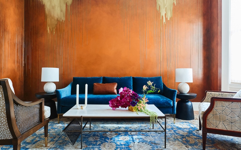
A dark/sharp color as the base of the palette
If you want the interior of your room to be special and different, use non-standard colors. The best option is a palette that is created in the proportion of 60/30/10, in which 60% and 30% of the surface of the room is decorated with neutral colors, and the remaining 10% are accents. Basic colors include neutral colors: beige, white, and gray, with the help of which the interior is never boring. Accent colors make the space lively and interesting, but have little effect on the overall perception. You can add different colors that express your personality and brighten up the interior.
Color perception
Everyone perceives colors individually, so to create the desired interior, think about which combinations evoke a positive emotion in you, which colors give you happiness and coziness. Determine the function of each space so you know which one to decorate. Choose the right shade and boldly use it in the form of decoration, furniture, textiles, and accessories.
Bright colors and good lighting
Light and sunshine are the best ways to lift your mood. Therefore, it is necessary to make sure that colored surfaces are well-lit. In the dark, even the warmest and most cheerful shade does not look so good and loses its cheerfulness. Add some artificial light sources to make the space bright enough at night or in bad weather.
Non-standard color combinations
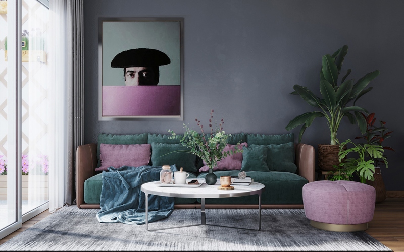
If you want your interior to be original and memorable, avoid patterned, faded combinations such as: white and blue, yellow and green, and white and gray. Turn on your imagination, and push the limits. Use a combination of orange, azure, or purple. These shades are deeper, more complex, and original because you don't often meet their combinations.
Colorful patterns and geometric shapes
The use of dark, saturated colors will help you create an interesting and different interior in the room. However, using them as the basis of a palette without overloading the space is difficult, so striking a balance is of the utmost importance. It is preferable to use ornaments and strict geometric shapes - straight lines, triangles, and circles, which will emphasize and enliven the interior.
Share the news